はじめに
Building Layouts in Flutterを読みながら実際にコードを書いていったときのメモです。
メモ
Containerはその子供のWidgetをカスタマイズすることができる
- パディング、マージン、ボーダー、背景色などを追加したいとき、Containerを使う
レイアウトを基本要素に分割
- RowとCoumnを見分ける
- レイアウトにグリッドはあるか?
- オーバーラップする要素はあるか?
- UIはタブが必要か?
- アライメントやパディング、ボーダーが必要なエリアに注目
プロジェクト内の画像の使うには
画像はプロジェクトルートに
imagesディレクトリを作ってその中に配置し、pubspec.yamlにassets項目を追加する。assets: - images/lake.jpg画像を使いたいところで、たとえば
Image.asset()を使うbody: new ListView( children: <Widget>[ new Image.asset( 'images/lake.jpg', width: 600.0, height: 240.0, fit: BoxFit.cover, ),fitプロパティの指定は、ドキュメントに画像付きで書かれてるいるのでわかりやすい
- https://docs.flutter.io/flutter/painting/BoxFit-class.html
BoxFit.coverはAndroidのImageView.ScaleTypeでいうところのCENTER_CROPかな?!
Image Classのドキュメント
左寄せにするには
crossAxisAlignment: CrossAxisAlignment.start,
余白を追加するには
Containerでラップして、paddingにEdgeInsetsを使う。
例えば、‘Oeschinen Lake Campground’というテキストと’Kandersteg, Switzerland’というテキストの間に8px余白を取りたい場合は次のようになる。
child: new Column(
    crossAxisAlignment: CrossAxisAlignment.start,
    children: <Widget>[
        new Container(
        padding: const EdgeInsets.only(bottom: 8.0),
        child: new Text('Oeschinen Lake Campground'),
        ),
        new Text('Kandersteg, Switzerland')
    ],
)
これをビルドすると、下図の赤枠の部分の余白ができる。
テキストのスタイルを設定するには
Textのプロパティのstyleで設定する。たとえばテキストをボールドにしたい場合は、次のようになる。
child: new Text(
    'Oeschinen Lake Campground',
    style: new TextStyle(
        fontWeight: FontWeight.bold
    ),
),
FontWeightは太さw100からw900の9段階あり、boldはw700の太さ。ちなみにnormalはw400
- フォントサイズやカラーを変更する場合もTextStyleを使用する。以下はフォントサイズを12ptにして、色をblueに設定している。
child: new Text(
    'CALL',
    style: new TextStyle(
    fontSize: 12.0,
    color: Colors.blue,
),
TextStyle
FontWeight
Flutterはコードフォーマットをサポート
https://flutter.io/formatting/
flutterコマンドで
$ flutter format lib/main.dart
とすればフォーマットされる。
書く開発環境でのプラグインでもサポートされていて、Android StudionならいつものCommand + Option + Lでフォーマットできる。
※Command + Option + Lでフォーマットしたあと、コマンドラインのflutter formatを実行すると、Unchanged lib/main.dartと出たので同じこと。
均等に配置するには
MainAxisAlignment.spaceEvenlyを使う。
ThemeのprimaryColorを取得するには
Color color = Theme.of(context).primaryColor;
長いテキストを折り返すには
TextクラスのsoftWrapプロパティをtrueに設定する。ただデフォルトtrueなので、明示的にtrueにしなくてもよい。
child: new Text(
    '''
Lake Oeschinen lies at the foot of the Blüemlisalp in the Bernese Alps. Situated 1,578 meters above sea level, it is one of the larger Alpine Lakes. A gondola ride from Kandersteg, followed by a half-hour walk through pastures and pine forest, leads you to the lake, which warms to 20 degrees Celsius in the summer. Activities enjoyed here include rowing, and riding the summer toboggan run.
''',
softWrap: true,
),
softWrrapをfalseにすると、折返さない。
こうなると、...を表示したくなるので、それをするには、TextクラスのoverflowプロパティにTextOverflow.ellipsisを設定する。
overflow: TextOverflow.ellipsis,
マテリアルデザインを使わなくてもいい
class NoMaterialApp extends StatelessWidget {
  @override
  Widget build(BuildContext context) {
    return new Container(
      decoration: new BoxDecoration(color: Colors.white),
      child: new Center(
        child: new Text('Hello World',
            textDirection: TextDirection.ltr,
            style: new TextStyle(fontSize: 40.0, color: Colors.black87)),
      ),
    );
  }
}
mainAxisAlignment and crossAxisAlignment
いまいちmainAxisとcrossAxisの違いがわからなかったけど、これでわかった。
https://flutter.io/tutorials/layout/#alignment
Stackとは
画像のようなWidgetに別のWidgetをのせたいときに使う
childrenの最初のWidgetがベースnoWidgetになって、次のWidgetがベースWidgetの上にのっかる
Stackのcontentはスクロールできない
コード例
class _MyHomePageState extends State<MyHomePage> {
  @override
  Widget build(BuildContext context) {
    var stack = new Stack(
      alignment: const Alignment(0.6, 0.6),
      children: [
        new CircleAvatar(
          backgroundImage: new AssetImage('images/pic.jpg'),
          radius: 100.0,
        ),
        new Container(
          decoration: new BoxDecoration(
            color: Colors.black45,
          ),
          child: new Text(
            'Mia B',
            style: new TextStyle(
              fontSize: 20.0,
              fontWeight: FontWeight.bold,
              color: Colors.white,
            ),
          ),
        ),
      ],
    );

    return new Scaffold(
      appBar: new AppBar(
        title: new Text(widget.title),
      ),
      body: new Center(
        child: stack,
      ),
    );
  }
}
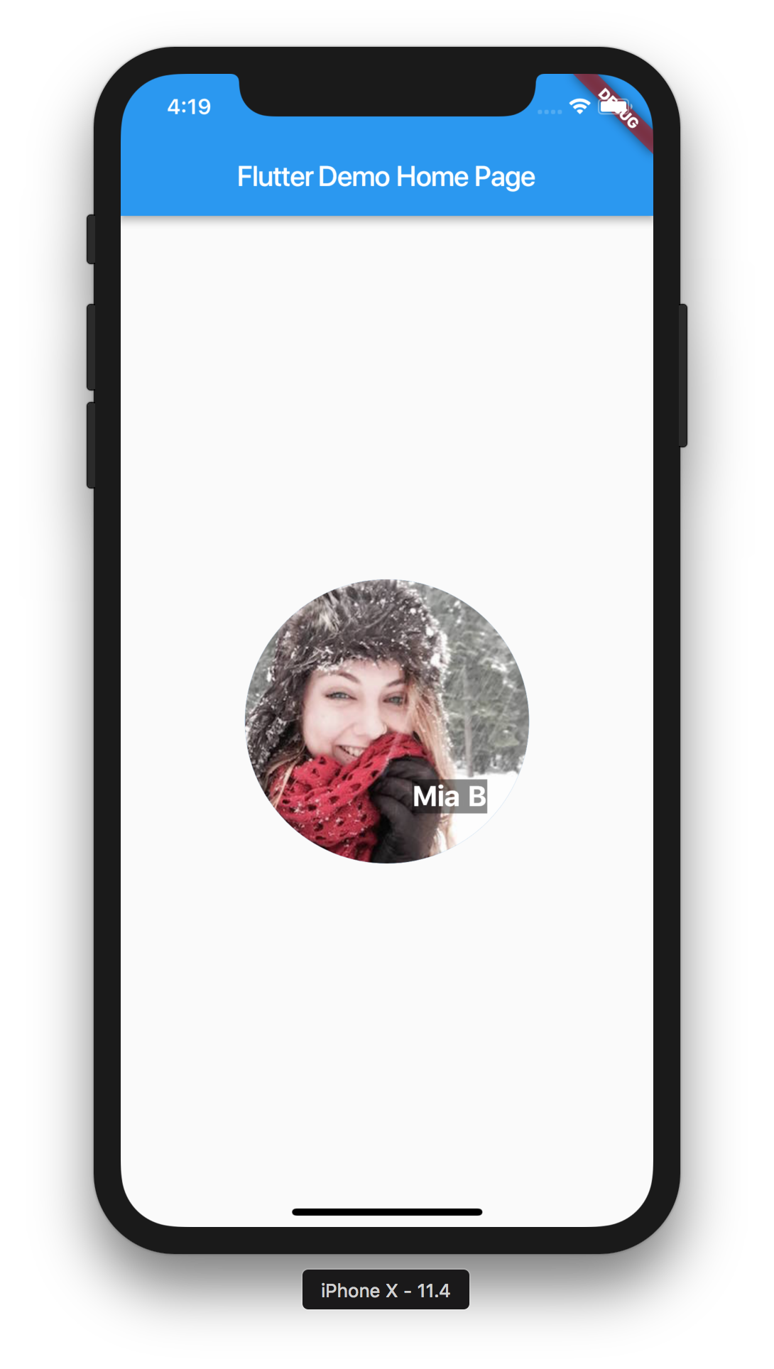
このコードのAlignmentは、オーバーラップしているText(Container)の位置を決定しています。
引数の値は-1~1の範囲で動き、画像の真ん中が0,0で左上が-1,-1となります。
0,0などのよく使われそうなやつは、Alignment.centerなどのように定義されています。
おわりに
上からざっと読みました。Building a layoutがレイアウトの基本的なことが書かれていて、[Lay out multiple widgets vertically and horizontally](Lay out multiple widgets vertically and horizontally)は応用という感じでしたので、さらっと目を通したぐらいですが、これを読んだおかけで、レイアウトの基本がわかった気がします。
comments powered by Disqus